Personal Site Redesign

I'm happy to announce that I've finally launched a long overdue facelift of my personal website, https://brodan.biz/.

Goals
There were a number of goals in mind with this redesign:
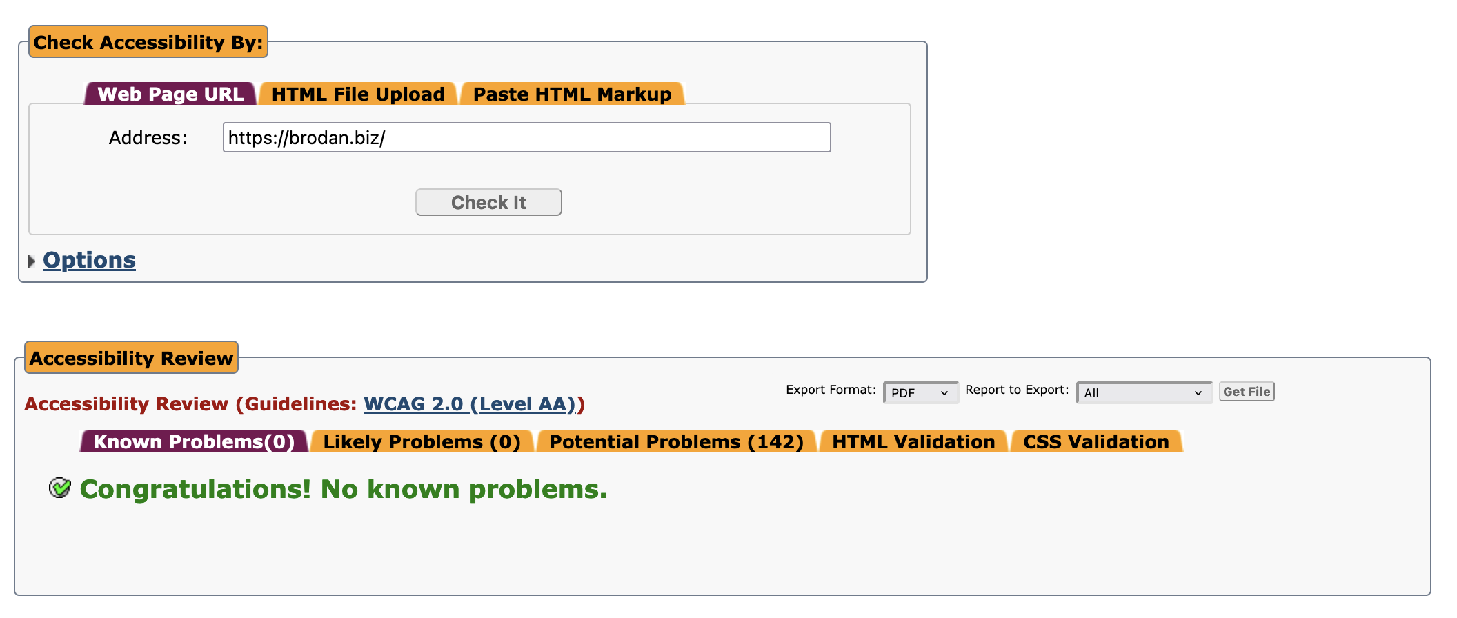
- Accessibility (a11y) - I wanted my site to be compliant with web accessibility standards as much as possible. I ran my existing site through a web accessibility checker and found a ton of areas for improvement.
- Appearance - I wanted to establish a more cohesive color theme, as well as an overall improvement in the layout and responsiveness of the site.
- Copy - The site had a lot of outdated links and copy that needed updating.
- Dependency Updates - I was running on a pretty old version of the Bootstrap framework and wanted to catch it up to the latest release (5.3).
Tools
A number of great, free tools were used to fulfill these goals, including:
- haikei for generating SVG graphics.
- Web Accessibility Checker for scanning the existing site to determine outstanding a11y work.
- Deque Color Contrast Analyzer for testing various font colors against various backgrounds for readability.
Results

I spent a good number of hours working to remedy all of the a11y problems the accessibility checking site reported, and I'm proud to say they've all been addressed! In the future I hope to fix as many of the "Potential Problems" as possible, as well.
The colors I ended up choosing were inspired by none other than Mountain Dew's Baja Blast. I also added a few SVG graphics to make the transitions between sections of the page a little more interesting. I'm not much of a designer, so there's definitely still room for improvement, but I'm happy with the new look.
The source code for my site is public and can be found on GitHub. Feedback is always welcome. Thanks for checking it out!